Saprea Main Website
Project Key Points:
Why?
In February of 2022, The Younique Foundation rebranded to Saprea. This transition provided an opportunity to redesign the organization website.
My role as designer
- Ui/Ux Lead
- Design and mockup pages through all devices.
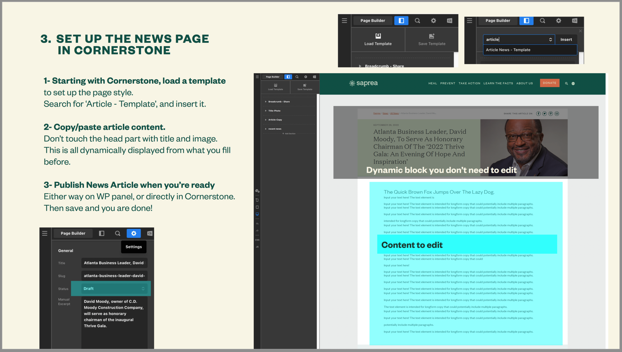
- Build pages from scratch on wordpress using Cornerstone theme builder.
Results
- I've built 15+ pages, on 3 navigation levels.
- Since the rebrand launch we constantly increasing our domains authority from SEO standpoint.
- Users stay longer on pages. And go deeper.
- Click maps indicate a good understanding of the content.
Know more about the skills I used for this project


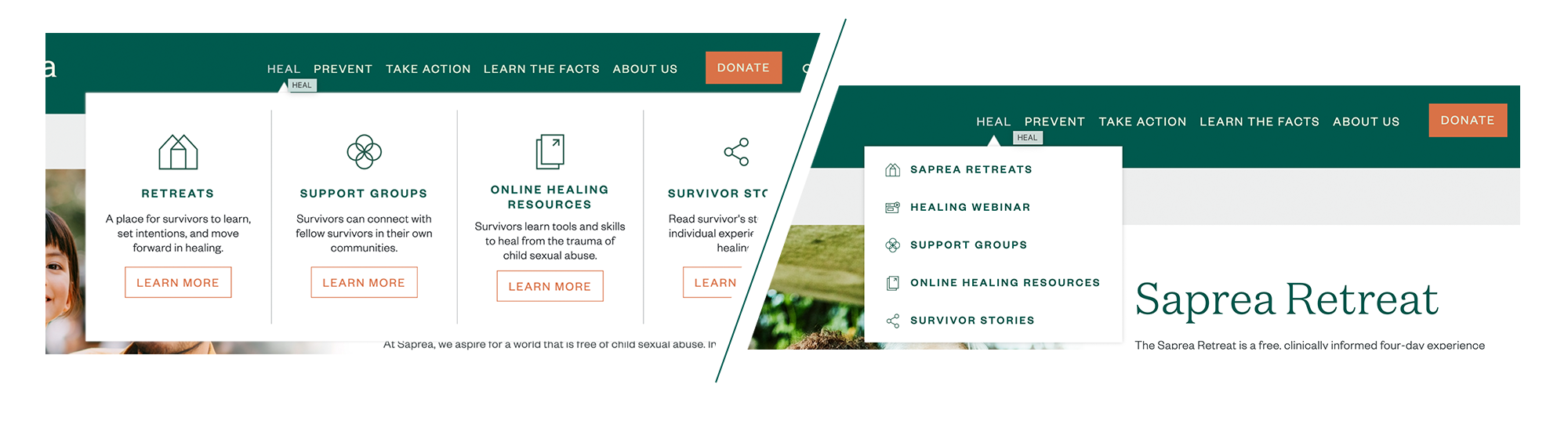
New pages creation
Multitude of services and products merged under one brand. From planification to production
Phase 1
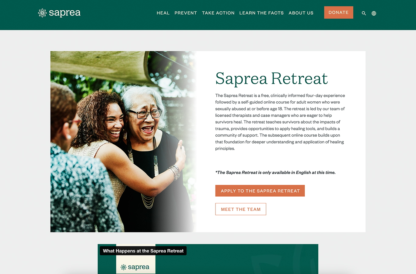
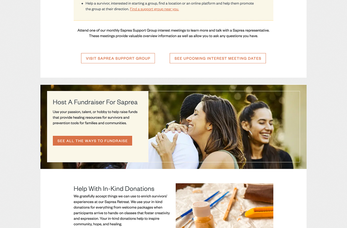
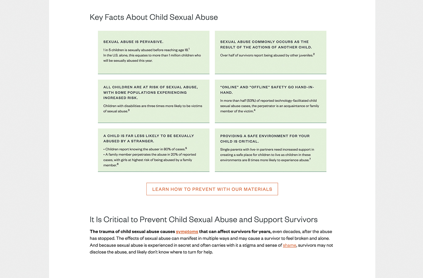
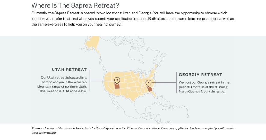
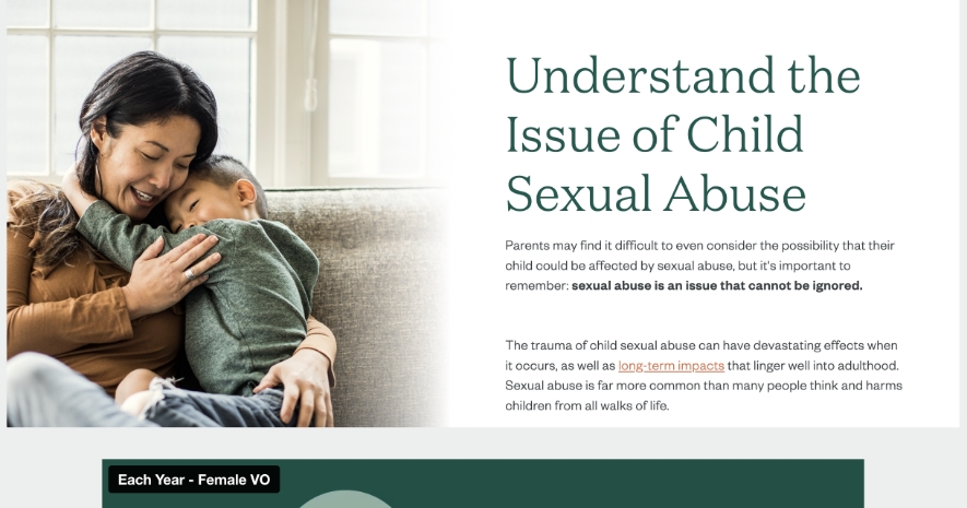
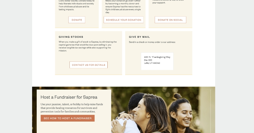
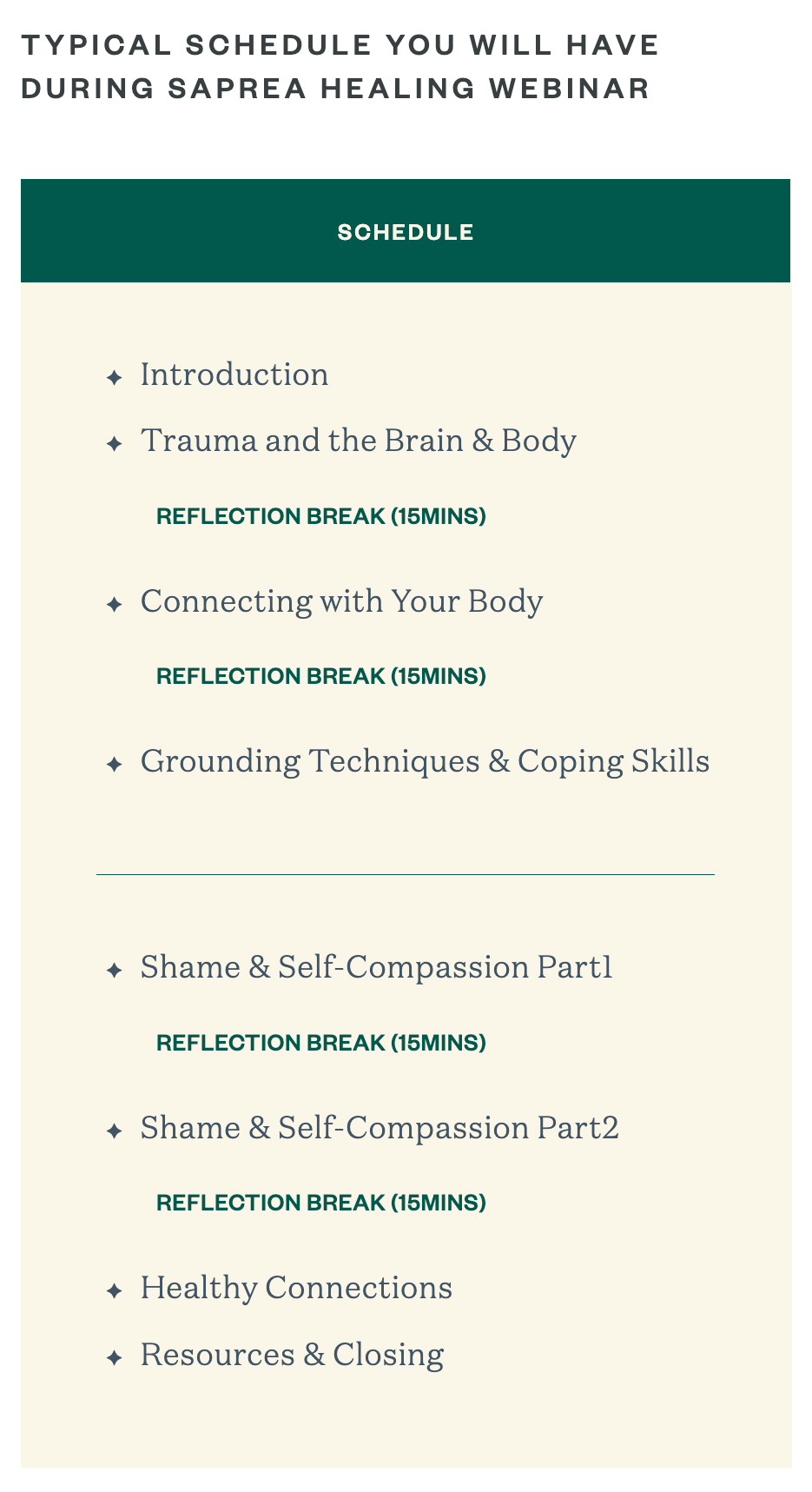
Mains pages like Saprea Retreat, Volunteering, Understanding the issue...
Phase 2
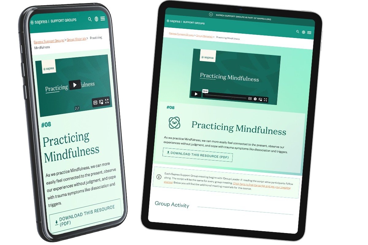
Support groups website
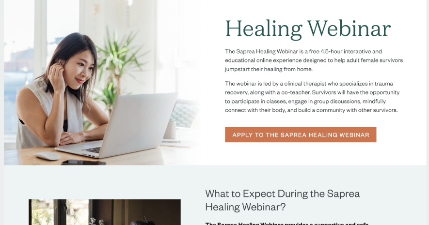
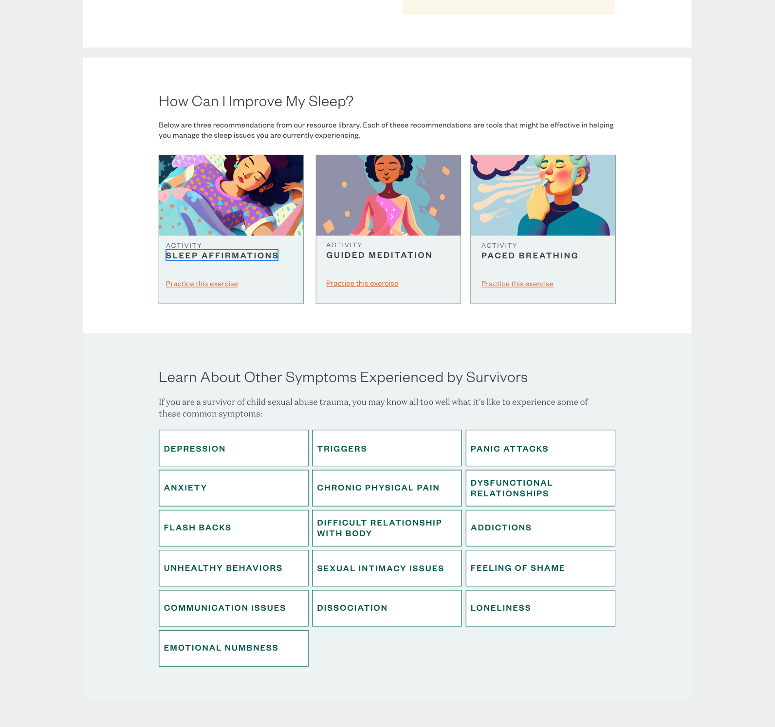
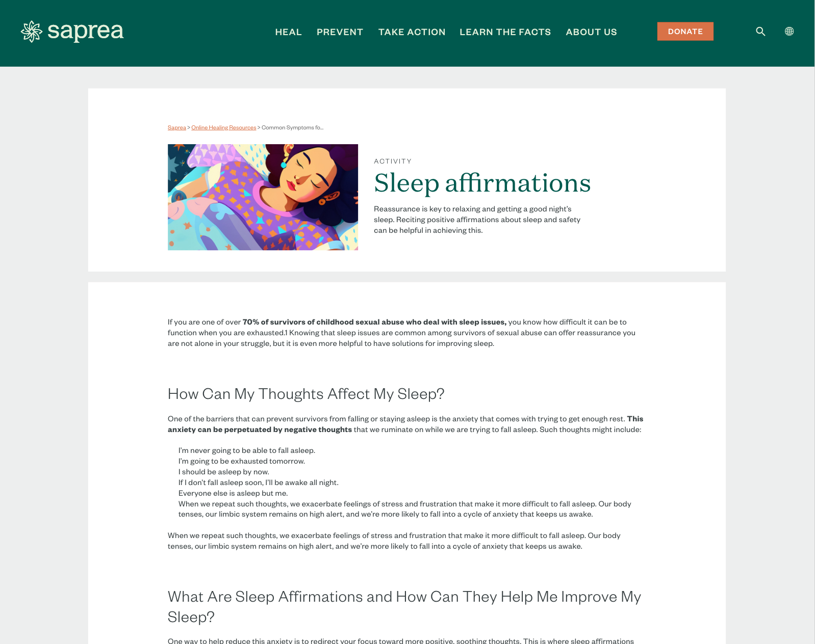
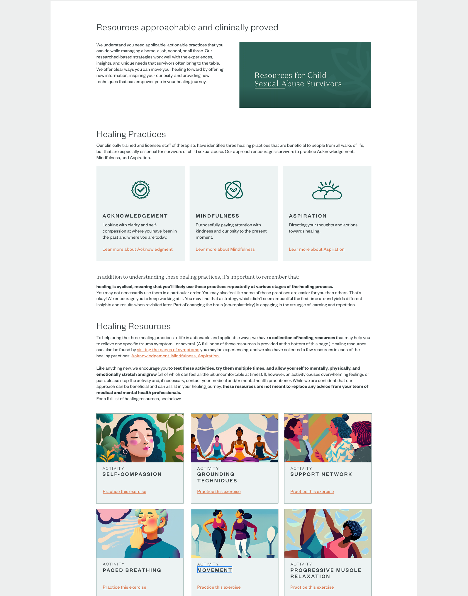
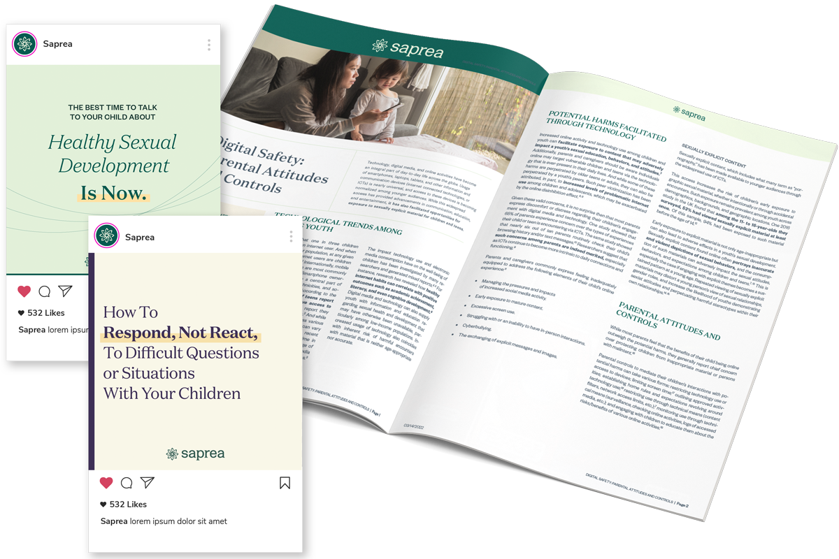
Healing resources, Survivors stories...
Phase 3: Wrap up
Prevention resources, last outstanding pages and elements...
Using last AI tools to provide improvements into our daily production, and into Design processes
'Healing Resources' services were designed using capabilities of Adobe Firefly. It was a useful tool that provided illustration we were struggling to illustrate before.
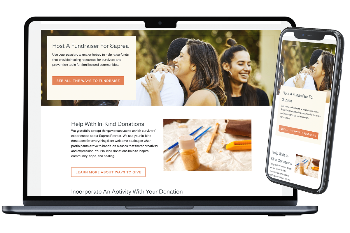
Insure continuity through all devices
Expertise on Ergonomic
When I joined Saprea in early 2022, the organization was in the midst of rebranding and rebranding its website. By the time I started, about 40% of the pages were already built and ready to go live, while the remaining 60% would be completed over the next few years. Few days after the launch, I conducted an ergonomic audit of the site.
I explained what ergonomics was and how it differed from UX. I analyzed the current interfaces, identifying areas that were working well and those that needed improvement.
And finally, I proposed solutions for short and long-term enhancements.
The audit was well received and led to changes in website navigation and content writing, resulting in a better user experience for Saprea's visitors.
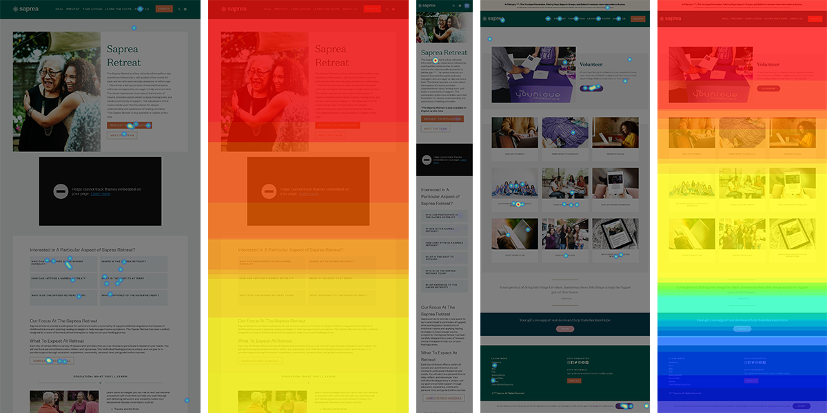
Search and gather datas to validate/improve
We used Users interviews, focus groups, and other tools like Hotjar to constantly scan and test previous products planned to be rebuilt, and any new product once it was live.
Improve accessibility and speed.
As this website is still under construction for some parts, there also a lot of little things to do to maintain and improve it along the way. Such as fixing missing responsive parts ( a block that have been built only for desktop, and that appear broken for mobile), or improving some shortcuts made for the first push ( like including gradient in images, and not in code). Even if some pages are done, we receive daily feedbacks on misleading links, some adjustments on wording, or errors on translations.
'Hero' image at the top of main pages:
A gradient was included inside the image at first. This was not noticeable on desktop, but not so aesthetic on mobile...
With coding the gradient, I was able to parameter it as I wanted, and choose whenever to display it, or not.
Work as a team, making sure everything I create will be usable and maintainable by everyone
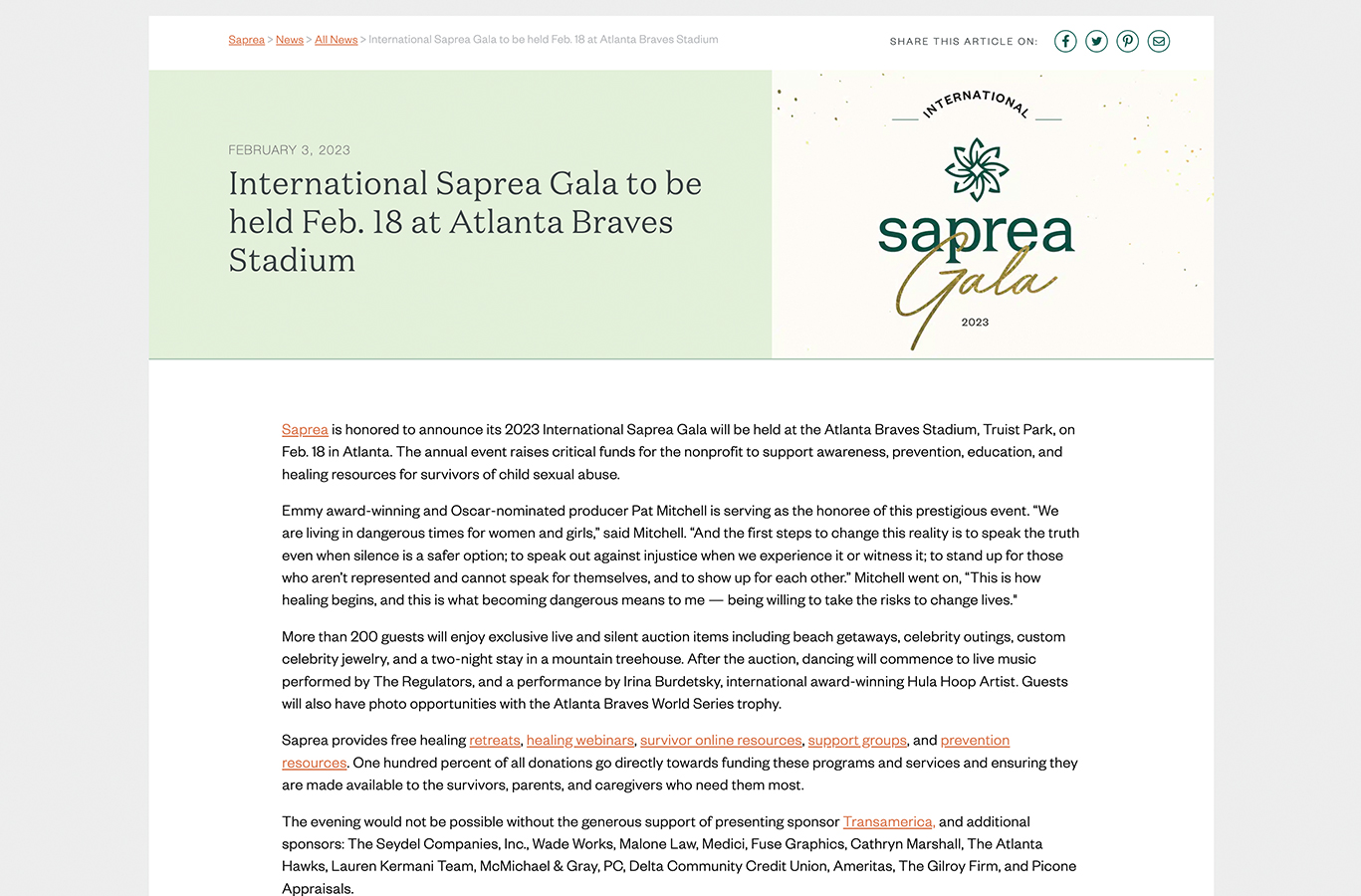
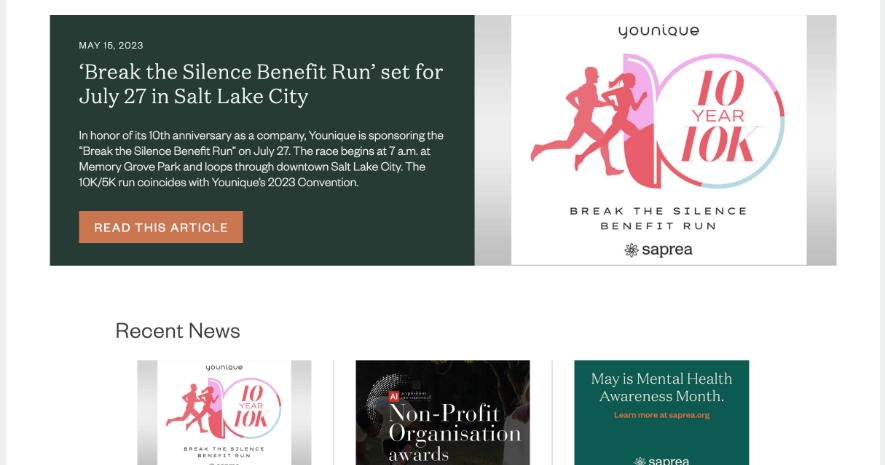
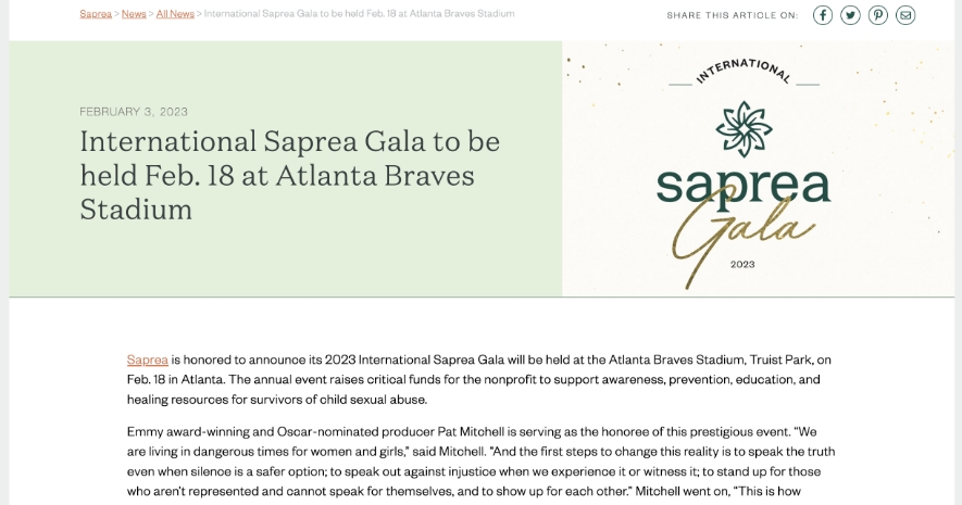
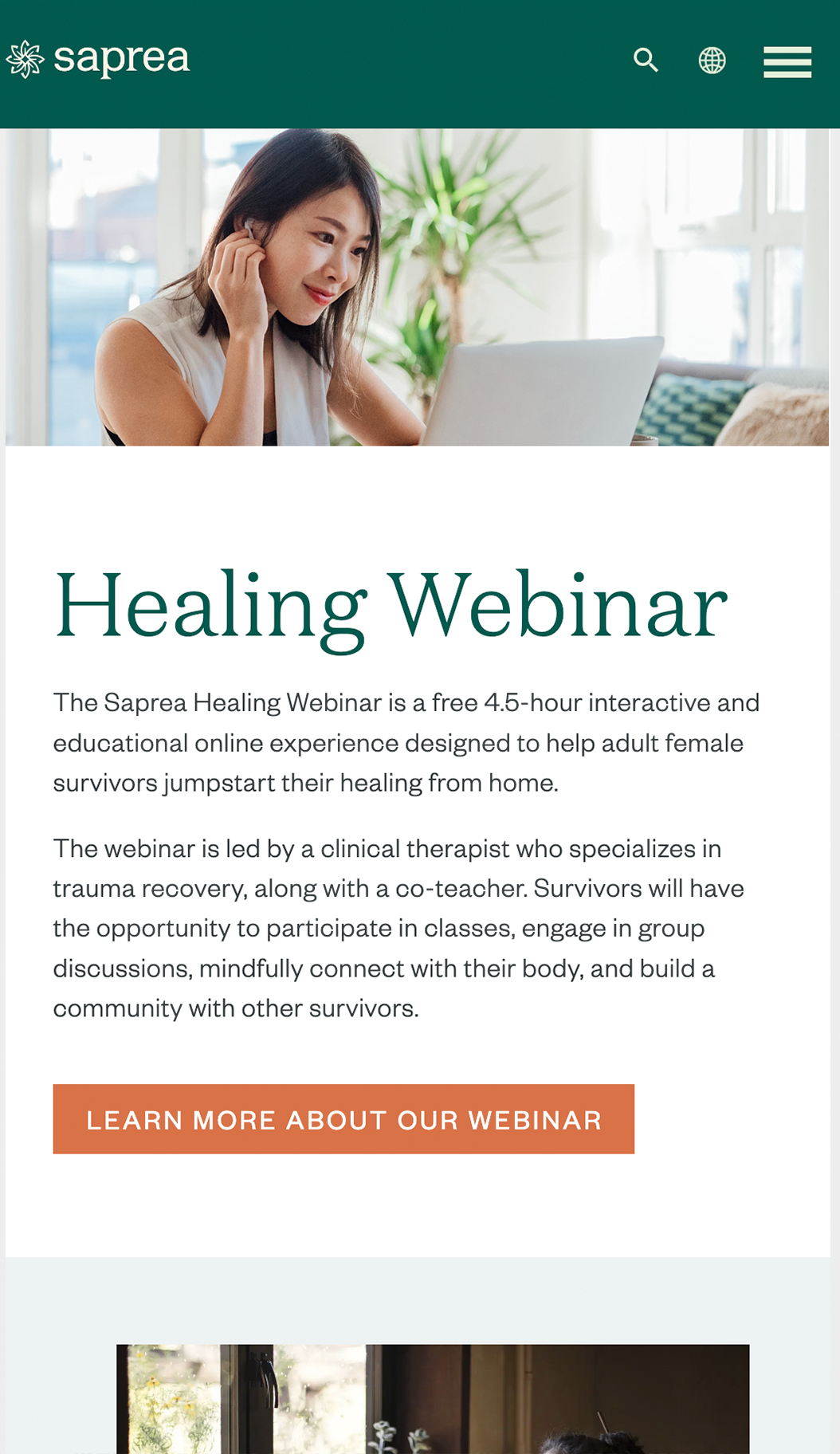
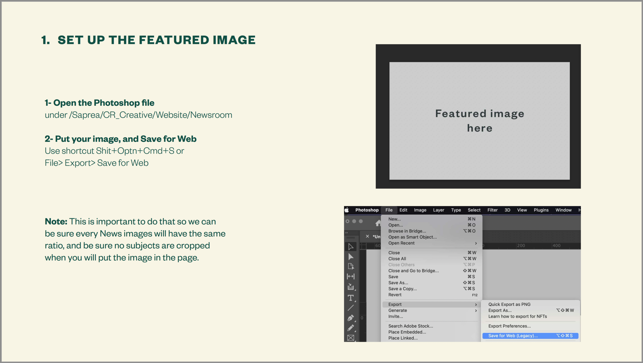
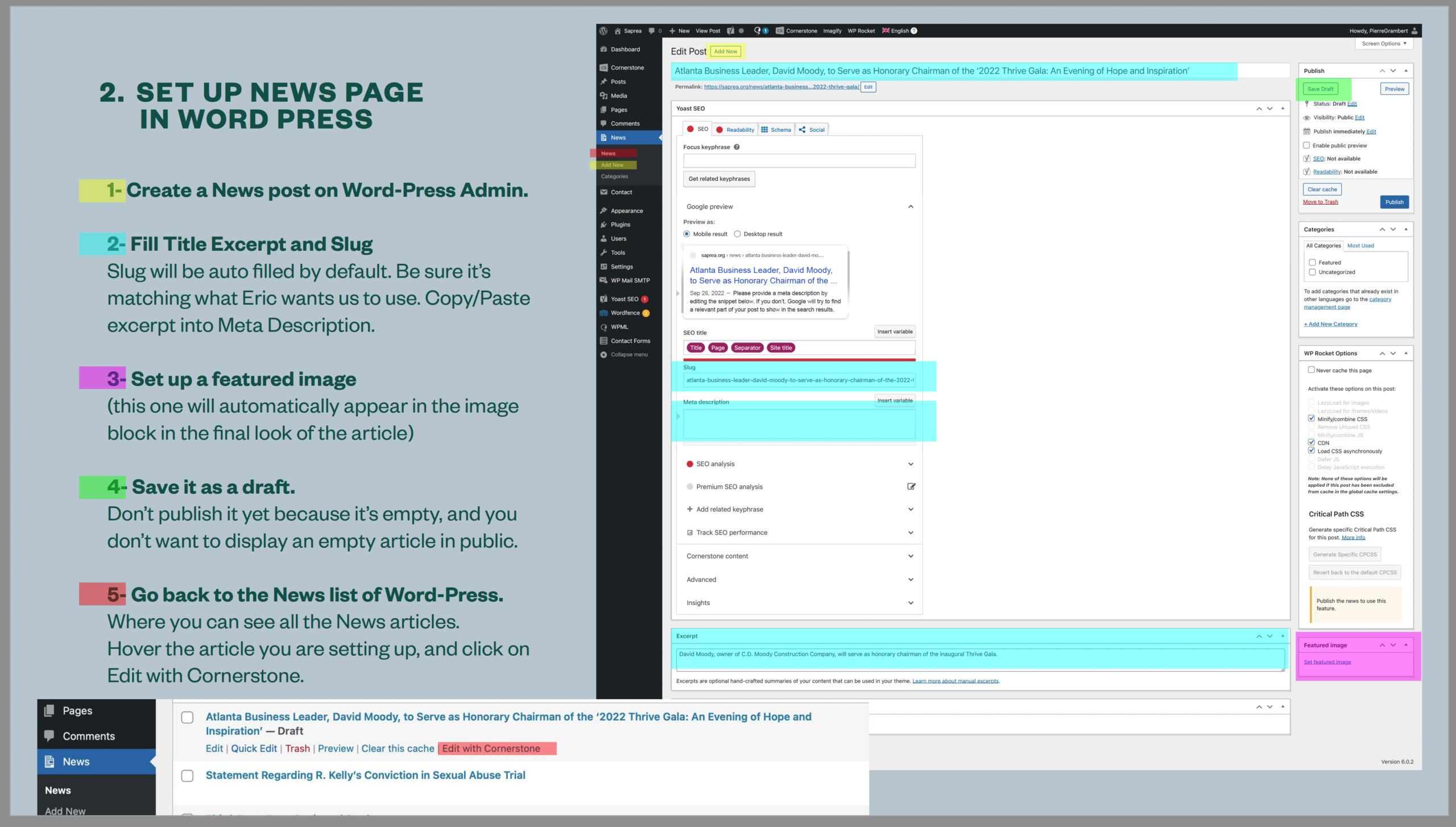
As the only UI/UX designer at Saprea, I organized digital projects and helped colleagues understand how to use them. Building the Blog and Newsroom sections was for example one great challenge, and seeing non-technical users create their own articles was satisfying.
My top priority was ensuring a seamless user experience for everyone at Saprea, even my coworkers.
View some projects from my experience at Saprea:
View other projects:
© Pierre Grambert 2023 - Website fully built by me, with the help of Wordpress
Turn on alternative layout with higher contrast